
An art deco Family Bathroom
Welcome to the first installment of the Behind the Design series, where I will break down some design work from the past and give you some tips on how to recreate the look yourself. As a former film student, much of my inspiration is influenced by movies and TV series. What a better way to represent feelings or moods of the character we follow, or to tell a story, than through the production design. This is the same principle I apply in interior design, which makes it far more interesting than just following interior design trends.
The design aesthetic I sought was of the 1920’s, to bring some of the luxury I feel has been lost in modern bathrooms. I am very attracted to styles like Art Deco because they elevate the space and make a real experience out of our everyday routines. It’s in the little details that we can make the mundane a little bit more magical. So this design was my Great Gatsby bathroom.

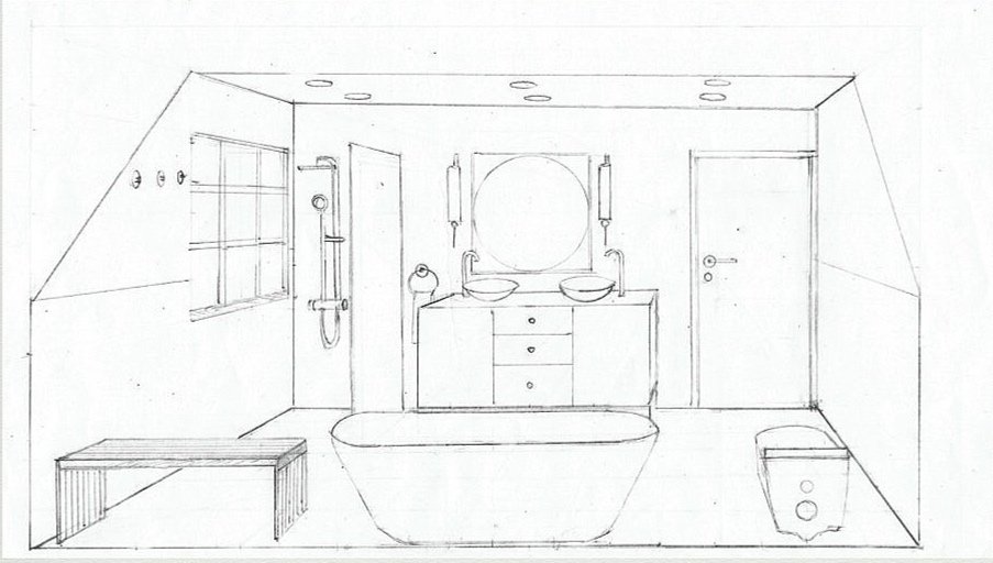
Tip #1 Think outside of the given layout.
We added extra headspace by opening a window on an inclined ceiling.
This bathroom is also an interesting example of how a renovation can be used to elevate a space, even if the current furniture and fixtures are in good condition and functional. I hope you find it inspiring, and as always, head to instagram for updates or behind the scenes material.
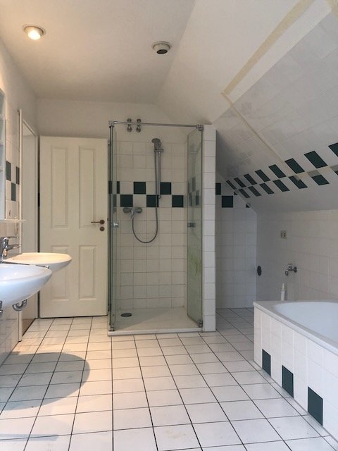


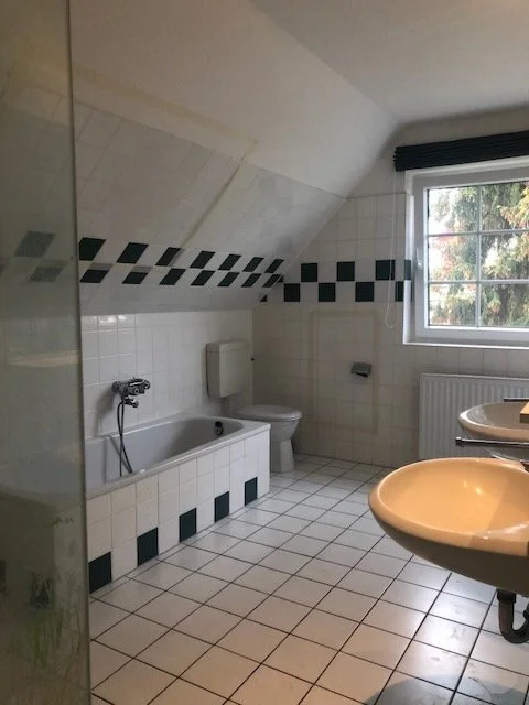
Although at first sight this bathroom might seem like it was ok (why change it if it’s not broken?) there were several issues that required structural changes. The room felt cold, and with the inclined ceiling, very claustrophobic. The shower placement was too close to the entrance door so it couldn’t be fully opened. There was also a very awkward space between the shower wall and the external wall, that the former owners had used to place a washing machine.
It took us many weeks of playing with the layout until we came up with something that made sense. We decided to open a new window, because aside from bringing in more light, it increases the ceiling height by 10 cm which is very needed right above the bathtub. We moved the shower to the other side of the room, and while there was some concern over what effect the humidity and direct water could have on the window, it ended up being the best placement. The window was PVC and not wood, plus we lined the sill with the same ceramic tile, which made it easy to clean. We also had it inclined a few degrees so the water could come off and not sit in the same place (which can be conducive to mold). Another way to keep a seamless look in a walk-in shower is to instal mosaic tiles for the floor instead of having a shower plate. The grout helps to keep the floor from becoming too slippery.
Tip #2 Inclined ceilings are a beast
It’s extra challenging to calculate the measures for the height and width of the shower panel, so watch that they don’t end up touching.
We ended up taking down the shower wall and using the space for the toilet. It breaks that one rule about not having the toilet face the entrance but it is far from the door and it was the only place left that wouldn’t take valuable space.
Since we had to take all the floors out, installing heated floors was almost a given choice. Always go for heated floors, it is efficient, and you’ll be walking on heaven during the cold days.

Tip #3 Have everything planned out beforehand.
When things are looking like this it won’t be easy to make changes trying to picture the end result. This moment I started questioning whether opening a new window was a smart idea after all… but I stuck to the planned design, which we never regretted aftewards.
Overall, we were very happy with the end result. As you can see, it brings hotel glamour to our home but remains easy to use and maintain. The extra open space allows for the parents to bathe the children or help along as they learn to use the toilet.


the black book info
For the ceramic tiles, we used Caesar, from Italy. The shower door (that had a beautiful antique ribbed texture) was from Drench, imported directly from UK. The fixtures were Grohe, the toilet, from Japanese Toto, and the furniture from Maisons du Monde. The bathtub was manufactured by Villeroy & Boch. And the creamy colored paint was “Drop cloth” by Farrow & Ball.
If this article is giving you some ideas about changing your own space, don’t hesitate to contact us at Menzel Mallorca for advice.